Interactive (clickable) world map with wxpython

Is it possible to implement a world map with wxpython, where user can zoom in/out, left/right click to execute functions, right click on a location on map to open pop-up menu etc? Is there a working example?

I know it’s possible to draw maps with Folium, but I think the user can’t left/right click on map locations to execute functions there.

I don’t want just to display a map. I want the user to be able to click on a location and perform.operations there. For example:

Zoom in onto Paris > right click on Paris > open pop-up menu > choose “display population” > a dialog pops up and displays population of Paris.

Or draw shapes on the map by providing the latitude and longitude of the location etc.

Hi steve2,

You can certainly do what you want using geopandas, pandas and matplotlib, which can be integrated in a wxPython interface.

I have written an app which downloads meteorological reports and can display data items on a map of the British Isles. I have customised it to zoom in/out using the mouse wheel and click and drag with the left mouse button to pan the map. If I click the right mouse button it pops up a small window containing the site number and name of the nearest report.

1 Like

Thanks, does it work fast? Zooming in/out, dragging the map etc is fast?

Zooming in/out is quite fast, planning is a bit slower, but it all depends on the performance of the PC.

I need to go out shortly, but in the meantime have a look at the following thread where I was asking questions about the zooming operation. Down the page it includes an animated GIF showing the zoom (the speckled appearance in that image is an artefact of the conversion to GIF):

https://discuss.wxpython.org/t/scroll-wheel-map-zoom/36016

1 Like

Here is an animated GIF from my actual met data app, showing temperature values at various reporting sites. It demonstrates zooming, panning and the right-click function to show the nearest reporting site.

1 Like

Is there a gpkg file that displays whole world?

There is one on https://gadm.org/download_world.html - click on the “single database” link.

However, the zip file is 1.5 GB and the gpkg file it contains is 2.8GB! I haven’t tested it, so I don’t know what the performance would be like.

I’ll see if I can find a smaller version somewhere.

Edit: Ha! it took 3 minutes 45 seconds just to load and display the map on my (10 year old) PC. Also, the resolution of the data caused the coastlines to merge in many places. Not very practical.

1 Like

Thanks, is there a small whole world gpkg file? I don’t need much details. Just earth map. I don’t need small towns, roads, mountain names etc. Country names and borders are enough for me. I have latitudes and longitudes in a separate file, I can mark the cities by myself using these coordinates.

I’ve found one possibility at: https://www.naturalearthdata.com/downloads/

If you click on the link for https://naciscdn.org/naturalearth/packages/natural_earth_vector.gpkg.zip

That file is just 436MB, the extracted natural_earth_vector.gpkg file is 885MB.

When I look in the extracted file in the DB Browser for SQLite app, it contains several tables for different types of vector. I tried selecting different ones by passing a layer argument.

I’ve only got one to work so far, by using:

self.world_data = gpd.read_file(“data/natural_earth_vector.gpkg”, layer=159)

This produces a low resolution coastline map of the world with country boundaries:

Screenshot at 2022-09-10 15-43-38

There should be 2 higher resolutions in the gpkg file, but I haven’t managed to get them to work yet.

1 Like

Thank you very much.

Hi Richard,

Do you know how to place dots for cities with different colors according to city coordinates on your example map above?

I tried editing your code as below. First it draws the map shape with self.drawMap() function, then it plots the dots on the map shape according to the coordinates. But all dots are drawn in red color. What if I want to plot a blue dot for one of the cities, Bogota for example?

def place_dots_on_coordinates(self):
    self.drawMap()
    df = pandas.DataFrame(
        {'City': ['Buenos Aires', 'Brasilia', 'Santiago', 'Bogota'],
         'Country': ['Argentina', 'Brazil', 'Chile', 'Colombia''],
         'Latitude': [-34.58, -15.78, -33.45, 4.60,],
         'Longitude': [-58.66, -47.91, -70.66, -74.08]})
    gdf = gpd.GeoDataFrame(
        df, geometry=gpd.points_from_xy(df.Longitude, df.Latitude))
    gdf.plot(ax=self.map_plot, color="red")
    self.canvas.draw()

Thanks

One possible way would be to create two GeoDataFrame objects, one containing the cities you want in red and the other containing the city/cities you want in blue. Then call each of their plot() methods, passing the required value for the color parameter.

Edit: There is an example of this technique on the following page:

https://towardsdatascience.com/geopandas-101-plot-any-data-with-a-latitude-and-longitude-on-a-map-98e01944b972

1 Like

Hi Richard,

Do you know how to convert location coordinates (latitude, longitude) to screen x, y points?
I would like to plot city names above city dots on the map.

In your code, it is possible to get screen coordinates and latitude, longitude info with mouse motion event, but how to do it without an event generation?

def onMotion(self, event):
    # get the x and y pixel coords
    self.x, self.y = event.x, event.y
    #event.xdata: longitude
    #event.ydata: latitude
    if event.inaxes:
        ax = event.inaxes  # the axes instance
        print('data coords %f %f %f %f' % (event.xdata, event.ydata, self.x, self.y))

Thanks
Best Regards

Hi Steve,

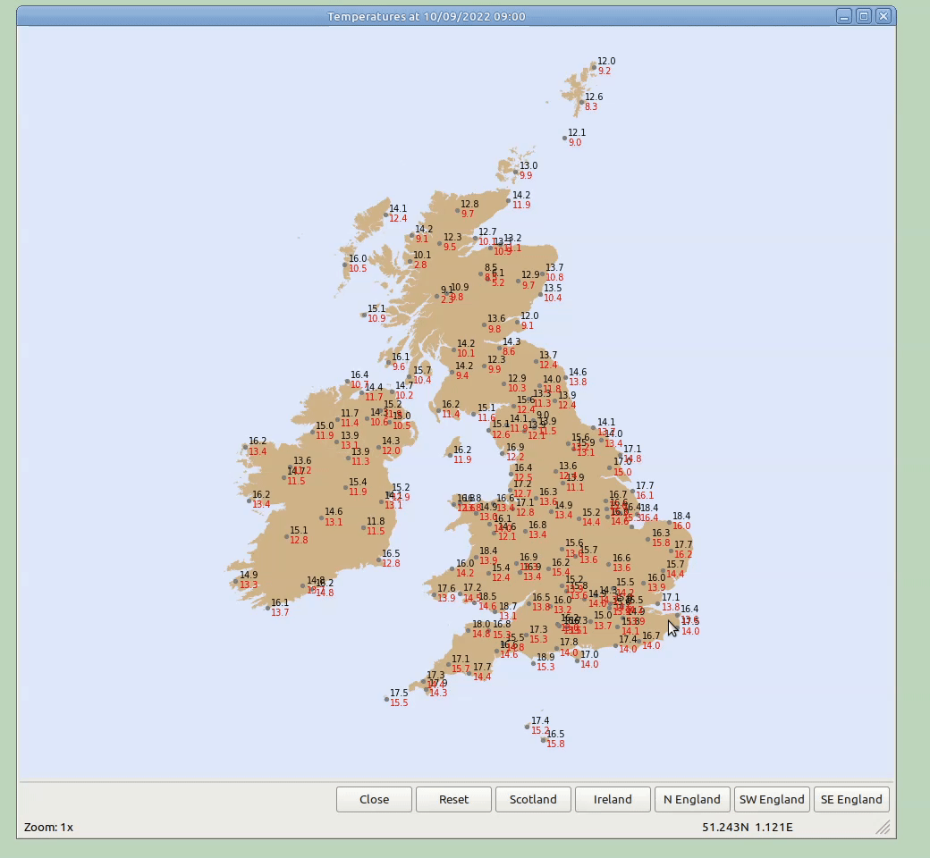
In my Met Data app I use the geometry attribute from the GeoDataFrame to get the x & y coords of each data point and then call chart.annotate() to draw the text values at a suitable offset.

Here is the method I use:

    def plotData(self, data_frame, data_type, points):
        """Plot the data on the map.

        :param data_frame: pandas.DataFrame containing the data.
        :param data_type: string, the type of data to be plotted.
        :param points: list of Point objects

        """
        columns = MetDataModel.CHART_DATA_COLUMNS[data_type]

        # Convert the DataFrame to a GeoDataFrame
        self.reports_gdf = gpd.GeoDataFrame(data_frame, crs=WGS84_EPSG_STR, geometry=points)

        if data_type == "Wind Arrows":
            self.axes.barbs(self.reports_gdf.geometry.x,
                            self.reports_gdf.geometry.y,
                            self.reports_gdf['u_comp'],
                            self.reports_gdf['v_comp'],
                            length=6,
                            linewidth=.7)

        else:
            # Add dots to mark the sites
            chart = self.reports_gdf.plot(ax=self.map_plot, color='grey', markersize=8)

            # Annotate map with the data values
            x_off = 3
            for i, column in enumerate(columns):
                y_off = 2 - (i * 8)

                for x, y, value in zip(self.reports_gdf.geometry.x,
                                       self.reports_gdf.geometry.y,
                                       self.reports_gdf[column]):
                    # Only plot values that are not 'nan'
                    if not math.isnan(value):
                        if data_type in ("Wind Speeds", "Present Weather"):
                            value = int(value)
                        chart.annotate(value,
                                       xy=(x, y),
                                       xytext=(x_off, y_off),
                                       textcoords="offset points",
                                       size=7,
                                       color=DATA_COLOURS[i])

        self.map_plot.set_aspect(DEFAULT_ASPECT)
        self.canvas.draw()

The calling method contains the following segment:

            # Extract the list of Points from the DataFrame
            points = gpd.points_from_xy(data_frame.Longitude, data_frame.Latitude)

            if points:
                # Plot the met data on the map
                self.plotData(data_frame, self.data_type, points)

            else:
                self.map_plot.set_aspect(DEFAULT_ASPECT)
                msg = "There is no data for %s" % dt_str
                # Plot message near the centre of the map
                self.map_plot.text(0.5, 0.4, msg, fontsize=12,
                                   transform=self.axes.transAxes,
                                   ha="center", va="center", color='red',
                                   bbox=dict(boxstyle="round, pad=0.4",
                                             facecolor="antiquewhite"))

Hopefully you will be able adapt parts of this code to suit your application.

Edit: here is the definition of MetDataModel.CHART_DATA_COLUMNS

CHART_DATA_COLUMNS = OrderedDict([
    (TEMPERATURES_CHART,    ("dry_bulb", "dew_point")),
    (WIND_ARROWS_CHART,     ("wind_dir", "wind_speed")),
    (WIND_SPEEDS_CHART,     ("wind_speed", "wind_gust_10")),
    (PRESENT_WEATHER_CHART, ("present_wx",)),
    (MSLP_CHART,            ("msl_pressure",)),
])
1 Like

Hi Richards,

I wrote a program to display a world map. The code is below. Each time the user left clicks on the map, a random country is selected. But at each click, map dimensions change. Could you please look at it and tell me what’s wrong here? Why does the map dimensions change at each left click? "ne_110m_admin_0_countries.shp" map file can be downloaded from this page .You should put the sample code inside the map file directory.

import wx
import matplotlib
from matplotlib.backends.backend_wxagg import FigureCanvasWxAgg as FigureCanvas
from matplotlib.figure import Figure
import geopandas as gpd
import random
import pathlib
import os


this_directory = print(pathlib.Path(__file__).parent.resolve())

WORLDX  = os.path.join(this_directory, "ne_110m_admin_0_countries.shp") 
WATER = '#defafc'
LAND = '#807e7e'
LEFT_MOUSE = matplotlib.backend_bases.MouseButton.LEFT


class MapFrame(wx.Frame):

    def __init__(self):
        wx.Frame.__init__(self, None, wx.ID_ANY, "Map",
                          style=wx.DEFAULT_FRAME_STYLE,
                          size=wx.Size(1200, 900))
        self.main_panel = MapPanel(self)
        self.Bind(wx.EVT_CLOSE, self.OnClose)

    def OnClose(self, _event):
        self.Destroy()
        wx.Exit()

class  MapPanel(wx.Panel):

    def __init__(self, parent):

        wx.Panel.__init__(self, parent)
        self.SetDoubleBuffered(True)


        self.figure = Figure()
        self.result_frame = parent
        self.canvas = FigureCanvas(self, -1, self.figure)
        self.axes = self.figure.add_axes([0, 0, 1, 1])
        self.axes.margins(0.0)
        self.axes.set_anchor('C')

        self.sizer = wx.BoxSizer(wx.VERTICAL)
        self.sizer.Add(self.canvas, 1, wx.LEFT | wx.TOP | wx.GROW)
        self.SetSizer(self.sizer)
        self.Fit()
        self.Layout()
        self.countries = ["US", "FR", "GB", "BR", "IN", "AU", "NZ", "IT", "DE"]
        self.gdf = None
        self.canvas.mpl_connect('button_press_event', self.onLeftClick)
        self.world_data = gpd.read_file(WORLDX)
        self.map_plot = None
        self.drawMap()

    def drawMap(self, country_highlight=None):
        """Draw the map on the canvas. """
        self.axes.clear()
        self.axes.axis('off')
        self.figure.set_facecolor(WATER)
        self.map_plot = self.world_data.to_crs(epsg=4326).plot(ax=self.axes, color=LAND)
        print("country highlight: ", country_highlight)
        if country_highlight:
            ylim = self.map_plot.get_ylim()
            xlim = self.map_plot.get_xlim()
            self.world_data[self.world_data.ISO_A2_EH == country_highlight].plot(edgecolor=u'gray', color='#fa8a48', ax=self.map_plot)
            self.map_plot.set_ylim(*ylim)
            self.map_plot.set_xlim(*xlim)

        self.canvas.draw()

    def onLeftClick(self, event):
        if event.button == LEFT_MOUSE:
            self.drawMap(random.choice(self.countries))


class MyApp(wx.App):
    def OnInit(self):
        frame = MapFrame()
        frame.Show()
        return True

if __name__ == "__main__":
    app = MyApp()
    app.MainLoop()

Hi Steve,

Sorry it’s taken a while, but I think I have found a possible solution.

  1. There is a typo in the line this_directory = print(pathlib.Path(__file__).parent.resolve())
    The print() function always returns None, so the subsequent os.path.join() call fails.
    It should just be this_directory = pathlib.Path(__file__).parent.resolve().

  2. If you call print(self.world_data.crs) it outputs “epsg:4326”, so I don’t think it is necessary to call
    self.world_data.to_crs(epsg=4326).

  3. The problem with the resizing is because calling the highlighted country’s plot() method changes the self.axes’ aspect ratio (you can see this by calling print(self.axes.get_aspect() after the plot() call). I don’t know why it changes the aspect ratio, but a fix would be to call ‘self.axes.set_aspect(1.0)’ before calling self.canvas.draw().

The resulting drawMap() method would be something like this:

    def drawMap(self, country_highlight=None):
        """Draw the map on the canvas. """
        self.axes.clear()
        self.axes.axis('off')
        self.figure.set_facecolor(WATER)
        self.map_plot = self.world_data.plot(ax=self.axes, color=LAND)
        print("country highlight: ", country_highlight)
        if country_highlight:
            country_data = self.world_data[self.world_data.ISO_A2_EH == country_highlight]
            country_data.plot(edgecolor=u'gray', color='#fa8a48', ax=self.map_plot)

        self.axes.set_aspect(1.0)
        self.canvas.draw()

You can increase the value passed to set_aspect() a bit if you prefer the map to be stretched vertically.

1 Like

Thank you very much.

Hi Richard,

Do you know how to connect 2 dots with a straight line on the map, using coordinate values, with geopandas?

I tried
geo_data_frame.plot([source_long, destination_lon], [source_latitude, destination_latitude], linewidth=2, color="red", alpha=0.5)

but apparently it won’t work.

Hi Steve,

I’ve not tried to draw lines on a map before. I’ve just spent a couple of hours investigating this, but I’m afraid I haven’t discovered anything that works.

Hi Steve,

I’ve had another look at this.

I think you need to call the plot method of the SubAxesPlot object, not the GeoDataFrame object.

i.e. if you plotted the map using:

self.map_plot = self.world_data.plot(ax=self.axes, color=LAND)

then calling the following should plot the line:

self.map_plot.plot([long1, long2], [lat1, lat2], linewidth=2, color="red", alpha=0.5)
1 Like