I sometimes like to use small, compact toggle buttons to show whether certain settings in an application are enabled or disabled and to allow those settings to be toggled by the user.
The toggle buttons will display simple bitmaps or short text strings to indicate their purpose, which can be amplified by tooltips.
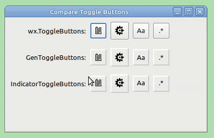
However, I don’t find the default appearance of wx.ToggleButtons makes it obvious to me whether the buttons are ‘on’ or ‘off’, This is because they show a darker grey background when they are pressed, or ‘on’. I associate ‘greyed-out’ buttons with them being disabled and thus find the appearance of wx.ToggleButtons to be counter-intuitive.
I find the generic toggle buttons provided by the wx.lib.buttons module to be an improvement as their backgrounds turn a lighter grey and they have an obvious 3-D pressed-in look when they are pressed, or ‘on’.
I wondered if it would be even more obvious if they also showed an indicator somewhat like a coloured LED when they were ‘on’? As an experiment I created the IndicatorToggleButton class (derived from GenBitmapToggleButton) which shows a coloured bar underneath the bitmap when the button is ‘on’. This uses some utility functions to create two new bitmaps based on the original bitmap but which have 4 extra rows of pixels at the bottom. For the bitmap used for the ‘off’ position the extra 4 rows are left blank. For the bitmap for the ‘on’ position the indicator is drawn across the 2nd and 3rd rows. I also created 2 derived classes which take either the pathname of an image file or a short piece of text in order to create the original bitmap for a button.
Here is a demonstration of the 3 types of toggle buttons:
Even if you don’t prefer the IndicatorToggleButtons you may find the techniques useful, so I have uploaded the code and the two image files in the following zip file: compare_toggle_buttons.zip (3.4 KB)
Tested using Python 3.10.12 + wxPython 4.2.1 gtk3 (phoenix) wxWidgets 3.2.2.1 on Linux Mint 21.2
Yes indeed, the SetBitmapSelected() method came in handy when I decided to sub-class the GenBitmapToggleButton class in order to create my IndicatorToggleButton class.
If you look at the code in the zip file I uploaded in my previous post, you will see that I call that method in IndicatorToggleButton.__init__().
Therefore, IndicatorToggleButton is just a GenBitmapToggleButton with a customised appearance.
class IndicatorToggleButton(GenBitmapToggleButton):
    """Provide a toggle button that shows an indicator when selected. """

    def __init__(self, parent, id=wx.ID_ANY,
                 original_bitmap=wx.NullBitmap,
                 indicator_len=DEFAULT_INDICATOR_LEN,
                 indicator_colour=DEFAULT_INDICATOR_COLOUR,
                 background_colour=TRANSPARENT_WHITE):
        """Initialise.

        :param parent: wx.Window, the toggle button's parent window.
        :param id: int, the toggle button's identifier.
        :param original_bitmap: wx.Bitmap, the bitmap from which the actual bitmaps will be created.
        :param indicator_len: int, the indicator's length.
        :param indicator_colour: wx.Colour, the indicator's colour.
        :param background_colour: wx.Colour, button's background colour.

        """
        GenBitmapToggleButton.__init__(self, parent, id, None)
        label_bitmap, selected_bitmap = createIndicatorToggleButtonBitmaps(original_bitmap,
                                                                           indicator_len,
                                                                           indicator_colour,
                                                                           background_colour)
        self.SetBitmapLabel(label_bitmap)
        self.SetBitmapSelected(selected_bitmap)
        self.SetUseFocusIndicator(False)
        self.SetInitialSize()
Nice work!
For Windows, GCDC is needed if you use a transparent background:
def createIndicatorToggleButtonBitmaps(original_bitmap, indicator_len, indicator_colour, background_colour):
    ....
    if 'wxMac' not in wx.PlatformInfo:
        dc = wx.GCDC(dc)
    ....
See also “/demo/Overlay.py”.
Unfortunately, the patch is still imperfect. I could not get a valid TextIndicatorToggleButton on Windows 10: