An On/Off button alternative to CheckBox

This is in reply to ZigZag about an issue with onoffbutton.py, which I, unfortunately, can’t recall where I originally posted.
I’m prepared to admit, I removed all traces of Microsoft from my life some 20 years ago, so I only test code on Linux. I also test on the version of python, currently 3.8.10, which comes standard on my OS.
I avoid virtual machines, as the box I have is tiny, due to living off grid and electricity shortfalls.
My excuses made, as far as I can tell, the issues lie with python3 version 10+ being more fussy about things and MS Windows.
Feel free to test this updated version and get back to me if there are still issues. I expect there could still be an issue around font.GetPixelSize(), where if it isn’t available I simply guess. I have no way of testing it, as it works happily on Linux.

Update: 2nd attempt to resolve font issues

onoffbutton.py (22.4 KB)

1 Like

:wink:

Morning da-dada,
I very much appreciate the input, put it down to me being a bit of pratt and not thinking beyond my own box.
Hopefully, that issue is now resolved in the updated code.
An invalid font is now swapped out for the system gui font and the label size calculation, is performed using a DC.

Regards Rolf

As these things are never finished, here is version 1.15.4 with various control styles.
onoffbutton.py (31.3 KB)

I’d like to thank Zig Zag for testing on the Windows platform
and at Zig Zag’s request, post a copy of ToggleButtonBitmap.

A custom class On/Off clickable image, where you supply an Off image and an On image
The images are scaled according to the size parameter you supply

ToggleButtonBitmap.2.0.0.zip (375.3 KB)

Version 1.16.0

  • Adjust label text colour automatically (black or white) based on the luminosity of the control’s
    background colour, ensures label is always visible.

  • Addition of function SetLabelTextColour to override automatic label text colour selection

onoffbutton.py (32.6 KB)

1 Like

looks (much) better (on Windows) :nerd_face:

  • the demo timer blocks a little

  • the Minimum Mone works on the ordinary Mono

@da-dada You have me at a disadvantage, I’ve not seen Windows since Windows 95 and NT 4, if memory serves :wink:
and before you ask, Yes! I do still use vi as my day to day simple editor.

Could you be a bit more specific about your points.
I’m not too worried about the timer, it is only to demonstrate the difference between Enabled and Disabled controls, every 5 seconds but I am wondering what the the Minimum Mone works on the ordinary Mono comment refers to.

Regards,
Rolf

Yes, pressing the “Minimum Mono” icon toggles the normal size mono on the left.
Tested with Windows 10.

@komto48g Sorry, but I’m not seeing it.
Unhelpfully, I labelled 4 of the demo buttons Minimum Mono, however each has its own name.

If you run this code from the command line, I print out the switch name and Id for identification purposes, just in case of this sort of issue.

Could you tell me which icon is being clicked and which is reacting, if possible by name or if not by position on the demo screen.
Also, just to be clear, is the clicked button reacting as well or is the clicked button doing nothing and the other button reacting instead?
Either I am blind or something queer is occurring.

Regards,
Rolf

The mini button does nothing and the other button reacts instead. Here is the snapshot:
AGDRec_20230222_013246.agm_clip.mp4

1 Like

@komoto48g I have finally worked out, that you are clicking on the overlapping multi-line label from the button on the left.
If you change self.onoff10 to be positioned further to the right e.g. (200,550)

self.onoff10 = OnOffButton(panel, -1, "Minimum Mono 4", pos=(200, 550),\
                                      initial=0, mono=True, circle=False, internal_style=2, name="10a")

That problem should stop happening.
To see the full extent of the label of self.onoff9 simply give it a background colour e.g.

self.onoff9.SetBackgroundColour("#bfefff") # lightblue

Let’s hope that is the answer or I’m flummoxed :grimacing:

perfect :smiling_face_with_three_hearts:

@da-dada Thanks! :grinning:

@rolfofsaxony pos=(250, 550) is better but slightly overlaps.

image

Just a layout issue, however, overlapping controls will cause z-order issues discussed here.
The problem is not the z-order itself but it is that gtk and win32 seem to behave differently.

The latest version 1.16.1 onoffbutton.py (33.3 KB)

1.16.1 Change Log

  • Alter demonstration to use sizers to avoid layout differences between gtk and other platforms
  • Minor change to alignment of icon and label for aesthetic reasons
  • Fix for Font change where self.GetFont was used instead of self.label.GetFont
    this could cause a truncated label
  • Font style flashes between Slant for Off and Normal for On

I’ve posted an updated version which uses sizers for the demonstration, to resolve OS layout differences

Yeah, using sizers could make the layout more platform-independent.
I like your idea of highlighting the on/off button by size, color, and direction because of its high visibility.

TBH, the last change seems unnecessary to me… :face_with_hand_over_mouth:

I agree! It was far too fussy.
The next release will lose it.

Hopefully the last version ( for a while :wink: )

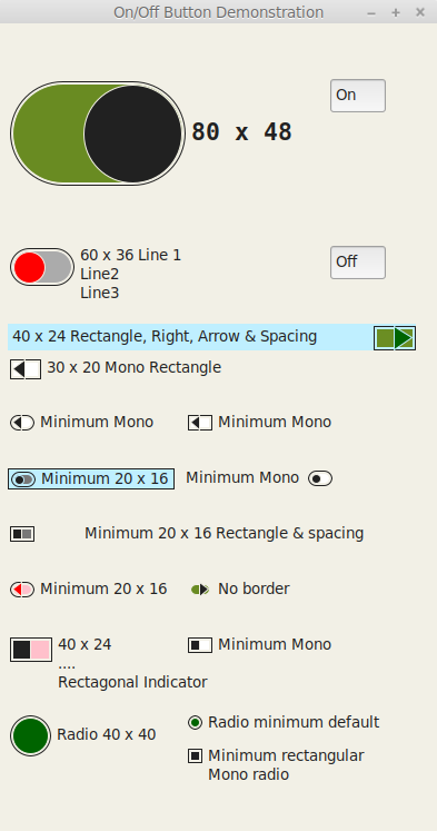
OnOffButton Version 1.17.2 (thanks to ZigZag/Ecco for testing on Windows)

Change Log:
1.17.2 Add highlighting colour to Border, principally for darkgrounds
Add internal_style OOB_SOFTRECTANGLE (Value 4) A rectangle with slightly rounded corners
Suggestions from ZigZag/Ecco

1.17.1 Fix bug calculating inner and outer radius which resulted in a float instead of an integer
this could affect round radio buttons with a size parameter containing different width and height values
Attempt to shift focus to next or previous widget, if focused widget is disabled
Fix for wxpython < 4.1 Colour has no option GetLuminance()
Micro adjustments to positioning
Include style wx.TRANSPARENT

1.17.0 Track focus by way of underlining Label Text if the control has Focus
return to normal Label Text if focus is lost
Font style flashing between Slant for Off and Normal for On - Removed
as too fussy, especially as I’m now tracking focus with Underlined text

    Why Underline and not a dotted box?
    Under Gtk StaticText doesn't appear to receive Paint events but wx.lib.stattext, which does,
     doesn't allow mnemonics and I want the mnemonics.
    So stuck between the devil and the deep blue sea, I've run with Underline

1.16.3 Allow spacebar key to toggle the onoffbutton.
All colours in the demonstration to hex codes
Changed demonstration to use a FlexGridSizer to accomodate smaller screens.

1.16.2 Minor adjustment to set minimum size for alignment
also prevents fractional cropping of image aligned to the right

onoffbutton.py (38.5 KB)

Also

OnOffButtonBox Version 1.2.3 (again thanks to ZigZag/Ecco for testing on Windows)

Change Log:
1.2.3 OnOffButton’s from version 1.17.2 include a new option OOB_SOFTRECTANGLE
This is included in the demonstration.

1.2.2 Spacebar Key is now a legitimate onoffbutton selector
To accomodate tabbing between widgets, the helpcontext button has focus disabled from the keyboard
add the last legitimate onoffbutton with focus is logged for reinstatement of focus
OnOffButton’s from version 1.17.0 now track focus with Underlined text

1.2.2 GridSizer replaced with FlexGridSizer, as the GridSizer compressed its contents
when the window was resized.
Amended for Windows OS layout differences
extended gap between widgets
added extra space around box
Added sizer flag wx.RESERVE_SPACE_EVEN_IF_HIDDEN

onoffbuttonbox.py (29.8 KB)

It’s the end of the month, so despite my hopes for onoffbutton changes being ended, here is the latest version.

Change Log:
1.18.0  Tracking focus, changes from underlining text to a rounded rectangle perimeter
         Achieved by adding focus bitmaps and expanding the bitmaps stated size, to cater for a Focus indicator area
        Pressing Alt Key on its own, identifies which widget has Focus
        Alt Key plus mnemonic continues to function as normal
        The default grey background has changed from #787878 (grey47) to #bfbfbf (grey75)
         for better contrast
        Minimum height has changed from 16 to 17 for better centring of the indicator.
        If the On or Off foreground colours are adjusted, the edge pen colour is adjusted for contrast
        Function SetOnOffColours added, which combines 4 colour functions, updating the images only once
        Internal style Arrow calculations change from using bitmap size, to use SetImageSize values for consistency
        Added functions:
            GetFocusStyle() and SetFocusStyle(style)

The big change is Focus tracking moving from underscored text to a visual perimeter for the control.
Focus has style, wx.PENSTYLE_SOLID is the default, wx.PENSTYLE_DOT is another good option and wx.PENSTYLE_TRANSPARENT should be used if you do not require a Focus indicator.

onoffbuttonbox.py (30.8 KB) onoffbutton.py (43.0 KB)

Oh Dear, just a month later and it’s time to issue Version 2.1.0

Principally, I’ve added
new button types
new alignment styles
and the ability to add your own images to be used as On/Off buttons.

the full changelog is below.

This zip file contains:
onoffbutton.py
onoffbuttonbox.py (used to select one of a number of mutually exclusive choices.)
onoffbuttonlist.py (used to select zero or more choices from a range of choices.)
The images used by the demonstration

onoff.zip (235.3 KB)

Regards,
Rolf

examples of the buttons available in the demonstrations:
onoffbutton

onoffbuttonbox

onoffbuttonlist

Change Log:
2.1.0 wx.StaticText has resizing issues on font change
https://github.com/wxWidgets/Phoenix/issues/1228
https://github.com/wxWidgets/wxWidgets/issues/16088
Whilst wx.lib.stattext.GenStaticText avoids these issues it does not appear to handle mnemonics
The problem has been resolved by using GetTextExtent and DoGetBestSize

    Added user supplied On and Off images with optional supplied focus images
    If focus images are supplied, supplied images do not require offsetting to allow for focus indicators
    If images are supplied, the ratio for rescaling is taken from the width/height ratio of the On image supplied.
     This is applied if no size or a partial size is given.

2.0.0 Depending on wxPython values for alignment of the control, proved somewhat confusing, so all alignment
values have become internal:
aligning to the left (default) is now controlled by OOB_LEFT
right by OOB_RIGHT
top by OOB_TOP
and bottom by OOB_BOTTOM
The alignment style changes, from being in the standard style parameter, to the internal_style parameter

    All of the above occurs as 2 new alignment styles are added.
    In addition to aligning the control to the Left or Right of the text, you may now align the control
    above (OOB_TOP) or below (OOB_BOTTOM) the text.

    When aligning a control Top or Bottom, this can be combined with Left or Right, so the control and text
    are aligned Left or Right, above one another. The default is Centred, one above the other.

    rotate is a new parameter, which will rotate the control image through 90° giving a vertical control, like
    a lightswitch.
    default is 0 - None | > 0 = 90° clockwise (On at the bottom) | < 0 = 90° anti-clockwise (On at the top)

    Additional micro alignment adjustments have been made

    Default OOB_CIRCLE given a fractional overlap for aesthetic reasons

    Changed the base Bitmap to depth=32, to ensure that a transparent bitmap can be created.
    This allows a transparent brush to be used if no background colour is specfied.
    This also caters to controls that are placed on a gradient coloured background.
    The downside is that you have to remember to include wx.TRANSPARENT_WINDOW if you override style.

    Set foreground colour based on background colour for visibility of control's simple border,
     if set, in dark mode.

    Adds internal_style OOB_GRADIENT a rectangular button using a gradient between colour On and colour Off
    Adds internal_style OOB_RADIOCHECK a radio button containing a Check mark when on
    Remove spacing function as a step too far.
    Demonstration now set in a scrolled panel for ease of use and includes extra option examples

1.19.0 Adds an internal call to Layout for those using direct positioning not sizers.
Adds internal_style OOB_BULLET